Home // Blog
Choosing the right Puff Ink For Screen Printing can change a flat design into a raised, tactile print. But the best option depends on more than the effect shown in a product photo. Fabric type, ink formulation, mesh count, deposit thickness, and curing conditions all influence the finished result. A soft cotton tee may respond differently from a polyester blend, and a puff additive may behave differently across brands. Small details matter.
In 2026, product labels and technical data sheets remain useful starting points, not guarantees. Check the manufacturer’s recommended mixing ratio, screen setup, and curing range before production. Then test the ink on the actual garment, using the same mesh, squeegee pressure, and dryer settings planned for the job. Look closely at the puff’s height, surface texture, color, and flexibility after cooling. Does it crack when stretched? Does the print feel too stiff? A quick test can reveal issues that a catalog cannot.
There is no universal “best” puff ink. A bold, high-rise finish may suit a large chest graphic, while a lower profile may work better for fine details or frequent wear. Even careful tests can miss differences between fabric batches or shop conditions. That is worth remembering. This guide explains how to compare puff ink options, assess practical performance, and choose a formula that fits your garment, artwork, and production process.
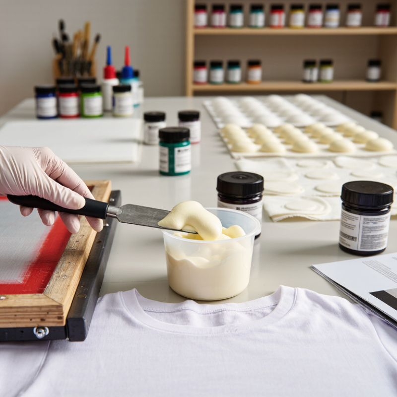
Puff ink creates a raised surface through heat. Many formulations contain a heat-activated blowing agent that expands during curing, lifting the printed layer. The effect depends on the ink, deposit thickness, fabric, and curing conditions. It is not simply “more heat, more puff.”
On press, the screen deposits a controlled layer of ink onto the garment. A thicker deposit may produce a taller finish, but excessive thickness can reduce detail or feel heavy. After printing, heat activates expansion. The surface rises as tiny bubbles form within the ink film. Watch the print as it cures. Too little heat can leave the ink under-cured and the effect weak; too much may flatten the texture or damage the fabric. Follow the ink’s technical guidance, and verify cure with an appropriate test rather than relying on appearance alone.
Small trials matter. Print a few samples on the actual garment, then compare them after cooling and washing. Check the edges, texture, and stretch. A soft cotton shirt and a smooth synthetic blend may respond differently. I have found that even a slight change in deposit can shift the finish noticeably. That can be frustrating. Still, a test print is more reliable than guessing from a product description.
How to Choose Puff Ink for Screen Printing in 2026?
Which Fabrics and Designs Suit Puff Ink
Puff ink works best on fabrics that can handle the required curing temperature and support a raised finish. Cotton jersey, heavier cotton blends, and fleece are often practical choices because their stable surfaces help the ink expand evenly. A smooth, medium-weight shirt usually gives clearer results than a thin, loosely knitted one. Stretchy fabrics can distort the print as they move, while textured fleece may make fine edges look less defined. Always check the ink’s technical instructions and test a fabric swatch before printing a full run. Small differences matter.
Designs with broad lines, simple lettering, and open spaces tend to show puff ink well. A thick wordmark or rounded graphic can create a noticeable, tactile surface. Tiny text, narrow outlines, and intricate illustrations may lose definition as the ink expands. Keep enough space between printed elements, too; otherwise, raised areas can merge. The result is not always perfectly even. Fabric weave, ink deposit, and curing conditions all affect the final height and feel. Compare a cured sample with the original artwork, then adjust line thickness or spacing if details close up. A little restraint often makes the texture more effective.
| Fabric or Design Factor | Suitability for Puff Ink | What to Consider | Practical Recommendation |
|---|---|---|---|
| 100% cotton | Generally suitable | Cotton is commonly used for screen-printed apparel. Fabric texture, garment dye, and any finishing treatment can affect ink adhesion and the final raised effect. | Test on the actual garment and follow the ink supplier’s curing instructions. |
| Cotton-rich blends | Often suitable, subject to testing | Polyester content may influence dye migration, hand feel, and curing requirements. Results vary by fabric construction and ink system. | Run a wash and cure test; use an ink system specified for the fabric when needed. |
| High-polyester fabrics | Use with caution | Some polyester dyes can migrate into the print during heating, changing its color. Synthetic fabrics may also require a different ink or low-bleed approach. | Test for dye migration after curing and cooling before producing a full run. |
| Nylon, coated, or water-resistant fabrics | Requires specific compatibility testing | Surface coatings and synthetic fibers can reduce adhesion or react poorly to heat. Some garments may not tolerate the curing conditions needed by a particular ink. | Confirm fabric and temperature compatibility with the ink supplier; test adhesion and wash durability. |
| Fleece and heavier knits | Often a good visual match | The raised effect can be prominent, but a highly textured surface may make fine details less distinct. Fabric thickness can affect heat transfer during curing. | Use a clear, bold design and verify that the print reaches the required cure throughout. |
| Fine lines, tiny lettering, and intricate detail | Usually less suitable | Puffing expands the printed area, which can soften small gaps and blur delicate shapes. | Choose thicker strokes, larger lettering, and open spacing; test the smallest details first. |
| Bold lettering, simple icons, and solid shapes | Well suited | Simple forms make the dimensional surface easier to see and help preserve legibility as the ink expands. | Use clean shapes with enough space between elements to allow for expansion. |
| Large solid print areas | Possible, but may feel heavy | Large deposits can produce a substantial hand feel and may be more prone to uneven expansion if the print is not controlled. | Consider using puff ink selectively, or test coverage and flexibility on the intended garment. |
| Layered prints and fine overlays | Needs careful planning | Raised ink changes the print surface and can affect registration or contact with later layers. | Plan the print sequence with the print shop and test the complete layer stack. |
| Curing and quality control | Essential for every fabric and design | Required temperature, dwell time, and curing method depend on the specific ink and equipment. A surface that looks dry is not proof of a complete cure. | Follow the product’s technical instructions and verify cure, adhesion, appearance, and wash performance on a sample. |
Selection tip: Choose puff ink based on the exact garment, artwork, and curing setup—not fabric name alone. Always make and evaluate a test print before a production run.
Compare puff ink formulas by looking beyond the label. Check the recommended mesh, stencil thickness, curing range, and whether the ink suits your fabric. A formula designed for cotton may behave differently on a polyester blend. Ask for a technical data sheet, then test a small print before committing to a production run. Details matter.
A useful comparison starts with a controlled sample. Keep the screen, squeegee pressure, deposit, and cure settings consistent. Print the same design with each candidate, then note its height, softness, edge definition, and color after curing. Measure the fabric temperature with a reliable probe; dryer settings alone do not confirm the ink reached its target temperature. Puff can look impressive when fresh, but a rushed cure may leave weak adhesion or a flattened finish after washing.
Wash-test samples according to the garment’s care instructions and compare them after several cycles. Record results, even if the outcome is disappointing. A taller print is not always better: thick deposits can feel stiff, crack, or lose detail in small lettering. There is no perfect formula for every shop. Fabric, equipment, and operator technique all change the result, so leave room for another test.
How to Choose Puff Ink for Screen Printing in 2026?
How to Check Printing, Curing, and Safety Requirements
Before choosing puff ink, ask for its technical data sheet and safety data sheet. Check the recommended mesh, stencil thickness, print order, and cure window. These details affect whether the ink rises evenly or leaves rough, flattened spots. Run a small test on the actual fabric, not just a similar swatch. Measure the garment’s surface temperature with a calibrated probe; dryer settings alone do not confirm the ink reached its required cure. Follow the supplier’s specified time and temperature, then wash-test samples after cooling. Puff varies. That is the point—and the frustration.
Review the SDS for ventilation, protective equipment, storage, and cleanup instructions, and train operators on those steps. The U.S. Bureau of Labor Statistics reported 2.8 recordable cases per 100 full-time workers in manufacturing in 2023. This broad industry figure is not a puff-ink risk estimate, but it supports treating shop-floor controls as routine, not optional. Keep containers closed, control access to hot equipment, and document test conditions and results. Recheck after changing fabric, underbase, print thickness, or dryer speed. A first pass may look excellent and still fail after washing; I have seen that assumption cost more than another test.
Check print performance, curing instructions, and safety documentation before selecting an ink. The chart converts Celsius to Fahrenheit; these temperatures are reference points, not universal cure settings. Follow the ink’s technical data sheet (TDS).
For curing, verify the ink film reaches the manufacturer’s specified temperature, rather than relying on the dryer’s setpoint. Test the print and puff effect on the intended fabric, and review the safety data sheet (SDS) for handling and ventilation requirements.
Screen Printing Guide · 2026
Choose puff ink by testing it on the actual fabric, not just a smooth sample card. Cotton, blends, and dark garments can behave differently under heat. Print a small test patch using your planned mesh, squeegee pressure, and underbase. Keep the ink deposit consistent; too little may produce a weak rise, while too much can blur fine details. Follow the ink supplier’s cure-temperature and dwell-time guidance, then check the result with a temperature probe rather than relying only on the dryer setting. The surface should look raised and even, not cracked or scorched. Small differences matter.
Match the finish to the artwork and garment. A bold chest graphic can tolerate more expansion than small lettering or thin lines. If detail softens, reduce the puff effect or simplify the artwork; I would not assume a thicker print is automatically better. Compare samples under normal lighting and feel them after cooling. A slightly uneven test may still reveal a useful setting, but repeat it before committing to a full run.
© Copyright 2025 PolyFab Plastic Industry LLC. All Rights Reserved.
